Geospatial Projects
Move Management Mapping Application
This project involved creating web-based enterprise mapping applications for internal clients.
Technologies Used: Portal for ArcGIS, ArcGIS Desktop, ArcGIS Web AppBuilder, and Inkscape for icon creation/modification
Data Sources: Internal Oracle databases for room and people data
Overview
In working on this project, I created production, web-based enterprise mapping applications. In addition to creating the applications, I also assessed client needs, facilitated interactions between clients and other IT personnel, and analyzed the data to be mapped to ensure the algorithms that fed data to the mapping applications were correct. I won the Director’s 2019 Institutional Operational Excellence Award for being the key architect and developer of the mapping component of the Computerized Move Management System for Optimized Office Space Utilization.
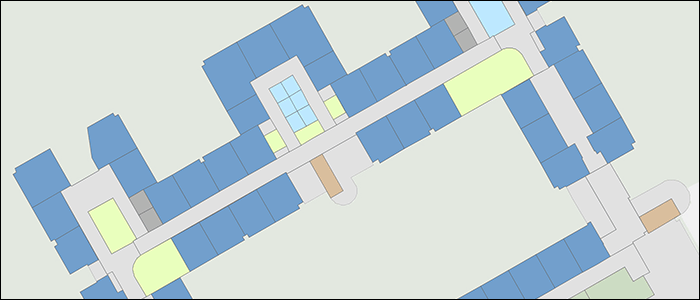
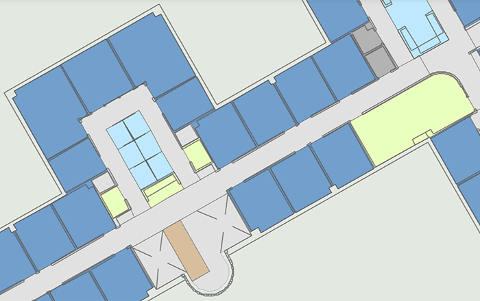
This image shows the various room types. For example, the dark and light blue colors represent different office types and the light green "office support" rooms include conference rooms and copy stations.
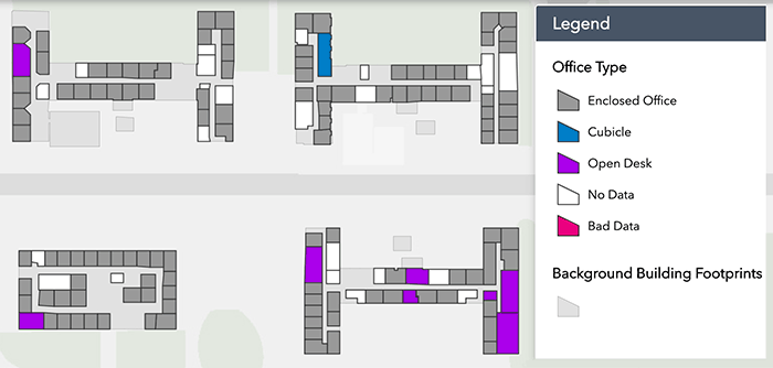
Office Type
The image at left displays the different types of offices (Enclosed Office, Cubicle, and Open Desk) as well as two categories to aid in data clean up (No Data and Bad Data)
Creating this map required standardization and clean up of the room classification data across the Lab.
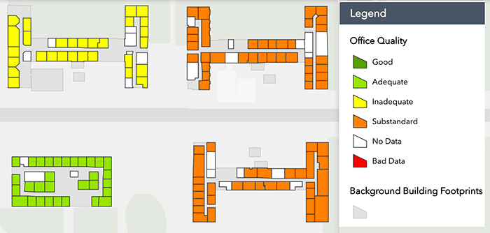
Office Quality
The image at left displays the classification system used for keeping track of the quality of offices. In addition to showing offices that are in need of a makeover (classified as Inadequate or Substandard), the map aided in correcting missing or bad office quality data.
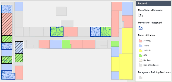
Visualize moves
The moves map at left shows two different move states (Move Status - Requested and Move Status - Reserved) as well as the Room Utilization metric.
Creating this map required standardization and clean up of the room occupancy data across the Lab.
San Francisco Envista Mapping Project
This online map displays construction projects from a live data feed.
Technologies Used: OpenStreetMap, Leaflet.js, Angular.js, HTML, CSS, JavaScript, and Python for initial data exploration
Data Sources: Envista construction projects from the City of San Francisco's Open Data portal
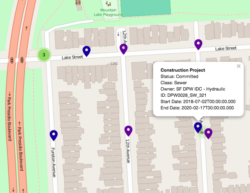
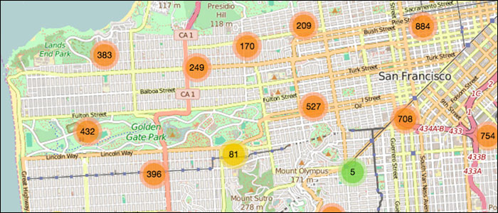
Zoomed-In View of Data Details
Left is a screenshot of the zoomable, interactive map showing the City of San Francisco's Envista construction projects using data from the City's Open Data portal.
At the most zoomed in levels, blue, purple, cyan and red markers show individual projects. Clicking on a marker reveals a popup showing pertinent information for that project.
Learn more:
- Access the online map
- GitHub Repository: https://github.com/hdavis/Envista
- Jupyter Notebook for Data Exploration: Acvive iPython Notebook or an HTML view of the notebook
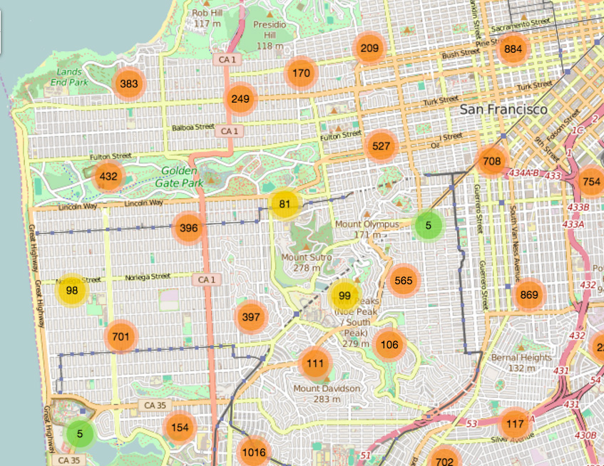
Zoomed-Out View
To avoid visual clutter, orange, yellow and green circles show clusters of data points when zoomed out. Orange signifies a high number of data points in that area, yellow a more moderate number and green a low number of projects.
Learn more:
- Access the online map
- GitHub Repository: https://github.com/hdavis/Envista
- Jupyter Notebook for Data Exploration: Acvive iPython Notebook or an HTML view of the notebook
ESRI Storymap Example
This project uses ESRI's Storymap capbility on ArcGIS Online to display salary data from NerdWallet.
Technologies Used: ArcGIS Online, Excel
Data Sources: NerdWallet, specifically this NerdWallet article

Overview of the Data
From the NerdWallet article:
When it comes to pay, women still make only about 78% of what men bring home. This is a tough truth about the lack of equal pay for equal work, but it isn’t necessarily the full picture.
New research by the American Association of University Women shows the pay gap can be smaller or bigger depending on where you live, with figures varying by as much as 25%.
To interact with the map, visit the Best Cities for Women in the Workforce web map.
For more information about the data, view the NerdWallet Article.
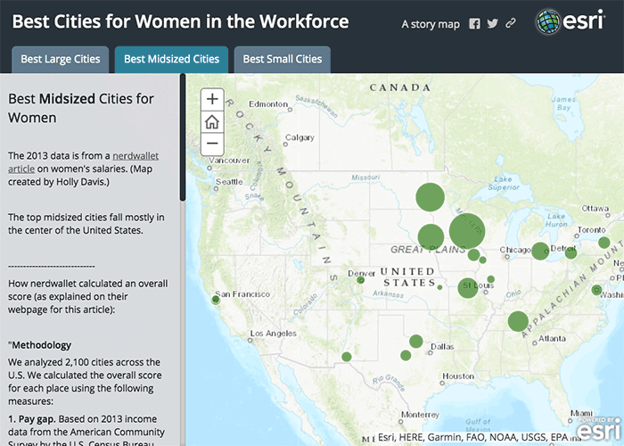
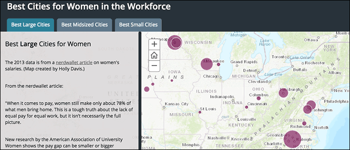
Best Midsized Cities for Women
Continuing the text from the NerdWallet article:
That made us wonder: Which U.S. cities offer the best economic opportunities for women? Could moving help your career? To find the answer, we analyzed 2,100 U.S. cities, and since not everyone wants to move to large urban centers, we also broke the list down into midsize and small cities.
Since the NerdWallet data is divided into three city-size categories, it lends itself nicely to ESRI's Storymap format which can include a map for each of the three city sizes.
This map shows the best midsized cities for women (in green) whereas the previous map showed the best small cities (in orange) and the next map the best large cities (in purple).
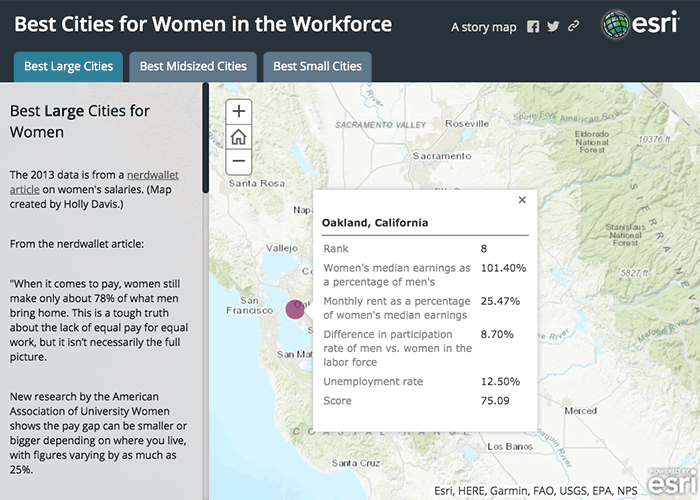
Breakdown of Oakland's Score
According to the Nerdwallet data, women in Oakland make more than men as shown by the value of 101.40% for the women's median earnings as a percentage of men's. It is worthwhile to look at the whole picture, however, to see that the unemployment rate is high in Oakland, which brings the total score down to 75.09 leading to a rank of 8 out of all large cities surveyed even though Oakland is one of the very few cities where women make more money than men.
To interact with the map, visit the Best Cities for Women in the Workforce web map.
Klamath Maps
This collection of maps was created when I was working as a Senior GIS Analyst at NOAA's Southwest Fisheries Science Center.
Technologies Used: ESRI's ArcGIS Desktop, Spatial Analyst, Network Analyst, ArcView, AML, MS Access, and Excel
Data Sources: Various, depending on the map
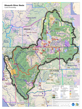
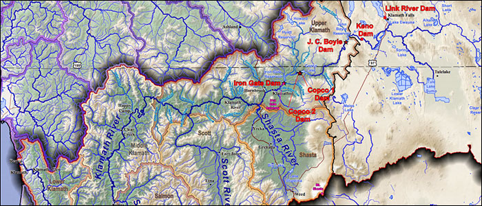
Klamath River Basin - Land Ownership
Wall-sized (36" x 48") Klamath River Basin poster showing administrative boundaries and land ownership.
This map and the following two maps comprise a suite of wall maps used by a team of economists to evaluate the prospect of removing four dams on the Klamath River.
To see the map in more detail, view the PDF version.
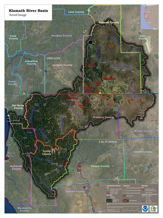
Klamath River Basin - Aerial Image
Wall-sized (36" x 48") Klamath River Basin poster showing satellite imagery and key administrative boundaries.
In addition to showing a photographic view of the land, this map highlights the U.S. Bureau of Reclamation's Klamath Irrigation Project boundaries, shown in yellow toward the center of the map.
To see the map in more detail, view the PDF version.
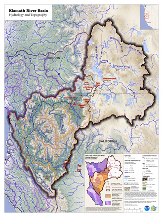
Klamath River Basin - Hydrology and Topography
Wall-sized (36" x 48") Klamath River Basin poster showing topography, river flow, and watersheds.
This map won a competition to be included in the 2011 ESRI Map Book, Volume 26.
To see the map in more detail, view the PDF version.
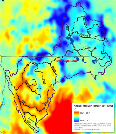
Klamath Annual Maximum Temperature
PowerPoint map of the annual maximum air temperature from 1961 to 1990 for the Klamath Basin area.
Temperature data from the PRISM Climate Group.
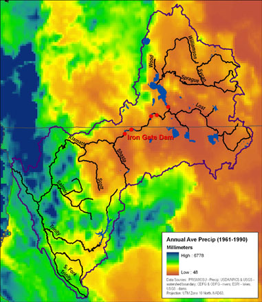
Klamath Annual Average Precipitation
PowerPoint map of the annual average precipitation from 1961 to 1990 for the Klamath Basin area.
Precipitation data from the PRISM Climate Group.
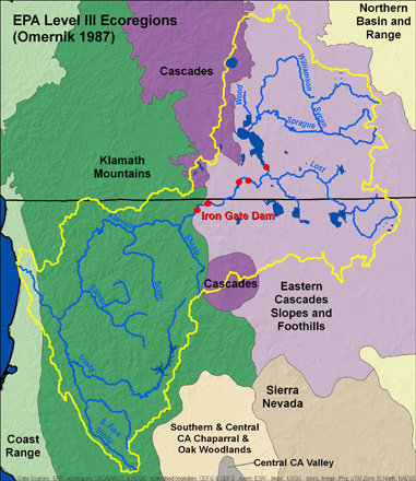
Klamath Ecoregions
PowerPoint map of the EPA Level III Ecoregions in and near the Klamath Basin in Oregon and California.
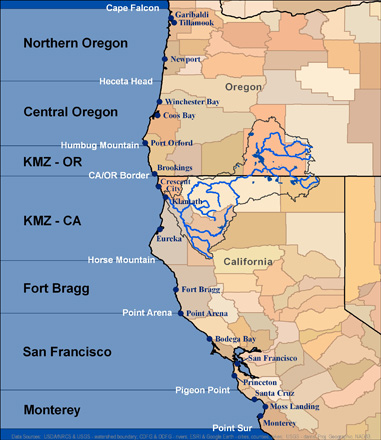
Salmon Management Zones
This 8.5" x 11" map shows the Oregon and California salmon management zones (Northern Oregon, Central Oregon, etc.) in the Pacific Ocean. KMZ stands for Klamath Management Zone.
The key locations used to divide one zone from another are displayed in white type (Heceta Head, Humbug Mountain, etc.).
In addition to the zones and key locations, the map shows key cities (in blue type), counties, states and the Klamath Basin watershed and associated rivers.
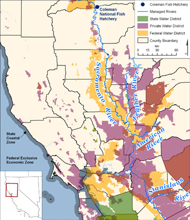
Jurisdictions a Salmon Swims Through
PowerPoint map of the jurisdictional areas a salmon swims through on its way from the Coleman Hatchery to the ocean and back again.
The jurisdictions include: various counties, private water districts, federal water districts, and state water districts while in streams and rivers; and the California State Coastal Zone and the U.S. Federal Exclusive Economic Zone (EEZ) when in the ocean.
Chesapeake Bay Maps
This collection of maps was created when I was working as a GIS Analyst at the Chesapeake Bay Program in Annapolis, Maryland.
Technologies Used: ESRI's ArcGIS Desktop, MS Access, and Excel
Data Sources: Various, depending on the map
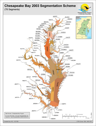
Chesapeake Bay Segmentation Scheme - 78 Segments
Chesapeake Bay segmentation scheme with 78 segments, some of which cross state boundaries.
To see the map in more detail, view the PDF version.
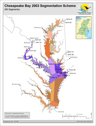
Chesapeake Bay Segmentation Scheme - 89 Segments
Chesapeake Bay segmentation scheme with the middle segments subdivided to match state boundaries yielding 89 total segments instead of 78. Only the divided segments are labeled and shown in purple.
To see the map in more detail, view the PDF version.
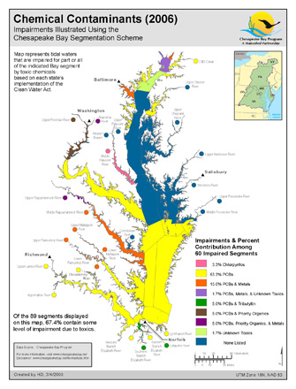
Chemical Contaminants
Chemical Contaminants for 2006 within the Chesapeake Bay.
Clearly showing the colors of the different toxics comfinations in the narrow tributaries of the rivers proved to be a challenge. I solved this mapping problem by using colored circles next to the name of the river segments that were too narrow to display their color on the map.
To see the map in more detail, view the PDF version.
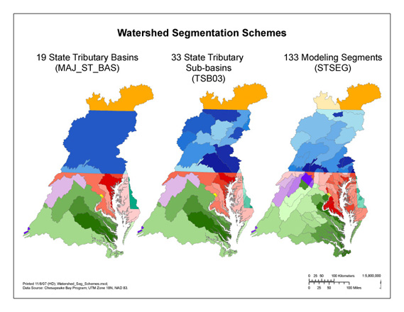
Bay Watershed Modeling Segmentation Schemes
Chesapeake Bay Watershed modeling segmentation schemes, colored by state. For example, Maryland's segments are shown in shades of red.
To see the map in more detail, view the PDF version.
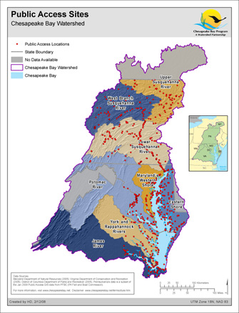
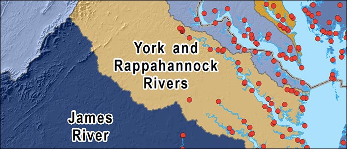
Public Access Sites
This map shows the public access sites within the Chesapeake Bay Watershed: locations along the Bay and the rivers that feed it where the public can enter the water.
In addition to displaying all the public access sites, this map aims to be viewable by those with red-green color blindness - the most common form of color blindness - by using different shades of blue and yellow and a wide range of color intensities from faint pastels to deep, rich colors.
To see the map in more detail, view the PDF version.
The Nature Conservancy Maps
This collection of maps was created when I was working as a Natural Capital GIS Intern at The Nature Conservancy in San Francisco.
Technologies Used: ESRI's ArcGIS Desktop, Spatial Analyst, MS Access, and Excel
Data Sources: Various, depending on the map
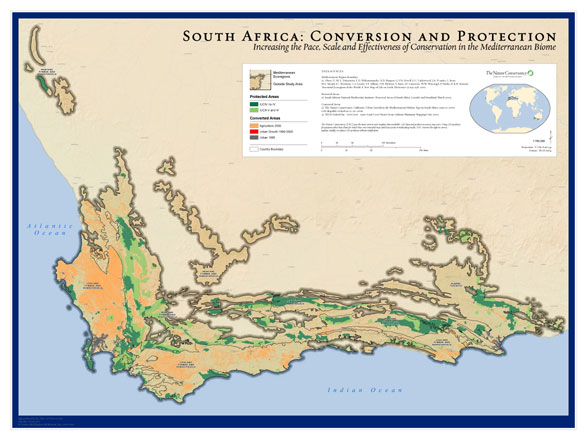
South Africa: Conversion and Protection
This map is a large wall map of areas converted from a natural state to a less natural state, such as to agriculture (in orange), as well as areas protected from conversion (in green) in the Mediterranean Biome in South Africa.
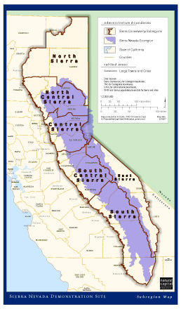
Sierra Nevada Demonstration Site - Subregion Map
This map shows the administrative boundaries within California's Sierra Nevada Demonstration Site for the Natural Capital Project.
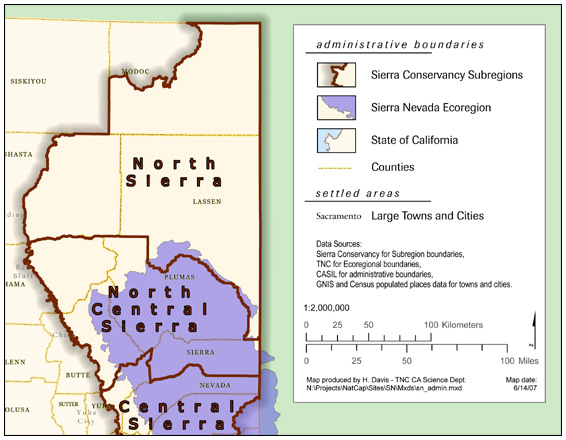
Legend Close-up - Sierra Nevada Demonstration Site
This map shows a close-up of the legend for the map above of the admisitrative boundaries of the Sierra Nevada Demonstration Site for the Natural Capital Project.
The rectangles for the legend were individually crafted to ensure they matched what the map was showing since the default legend produced by ArcGIS did not look like the map due to the dropshadow effect.
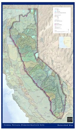
Watershed Map - Sierra Nevada Demonstration Site
This map shows the watersheds in California's Sierra Nevada Demonstration Site for the Natural Capital Project.
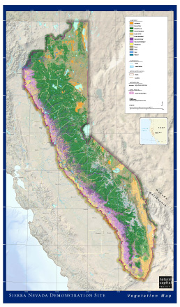
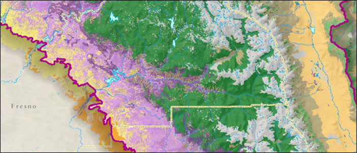
Vegetation Map - Sierra Nevada Demonstration Site
This wall-sized map shows the vegetation within California's Sierra Nevada Demonstration Site for the Natural Capital Project.
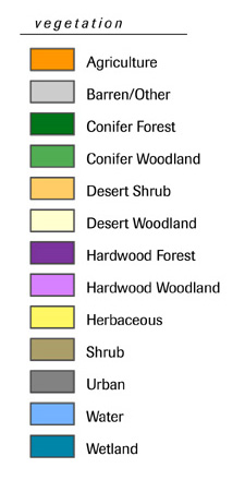
Vegetation Map Legend
Legend for the Sierra Nevada Demonstration Site Vegetation Map.
My goal was to use a pleasing combination of complimentary colors that resonated with viewers existing visual vocabulary of map colors (e.g. urban often means asphalt or contrete so is shown in grey, evergreen conifer trees are shown in shades of green, etc.).
Close-up of Vegetation Map
Close-up of vegetation within the Sierra Nevada Demonstration Site for the Natural Capital Project.
Miscellaneous Maps
This collection of maps was created as I was learning GIS.
Technologies Used: ESRI's ArcGIS Desktop, Spatial Analyst, MS Access, and Excel
Data Sources: Various, depending on the map
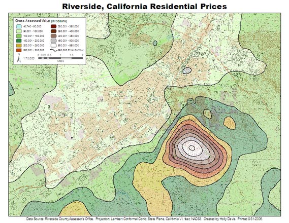
Riverside Residential Prices
Distribution of residential housing prices in Riverside, California circa 2005.
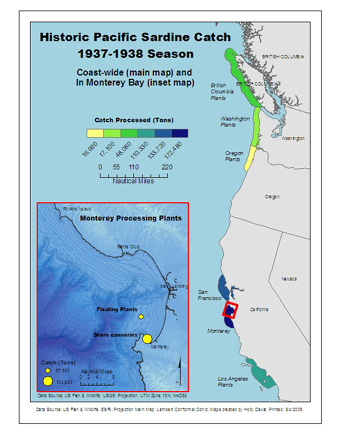
Historic Pacific Sardine Catch - 1937-1938 Season
Historic Pacific Sardine catch for the 1937-1938 season.
This map and the following map were created as a volunteer project for a professor doing research on Historic Sardine Catches in the Pacific Ocean.
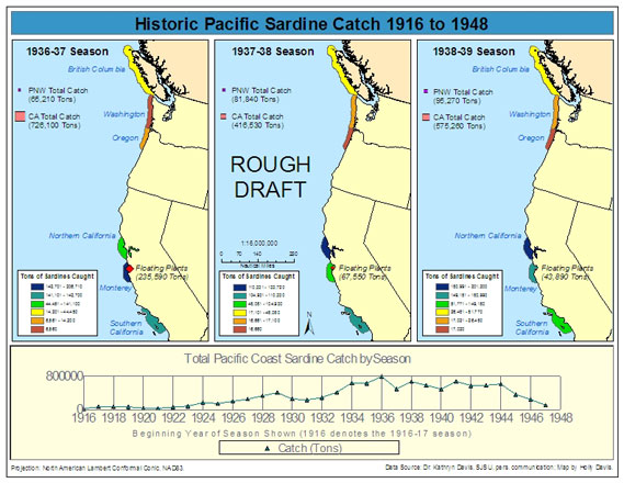
Historic Pacific Sardine Catch - 1916-1948
Map and graph of West Coast historic Pacific Sardine catch spanning 1916 to 1948.
By creating a simple graph of the time-series data below the map, I was able to spot an odd value in the total catch numbers since the value was an order of magnitude larger than the other values. Consultation with the professor doing the research confirmed that an order of magnitude increase in catch at that point in time was extremely unlikely. After going back to the original data source, the professor confirmated that the odd value was a data entry error made by one of her students.
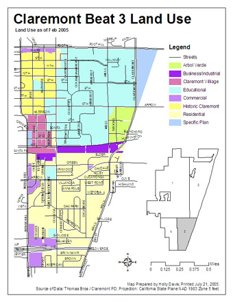
Claremont Land Use
Land use in Claremont, California, Beat 3.
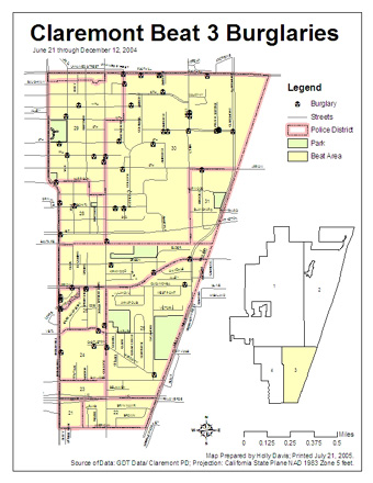
Claremont Burglaries
Burglaries in Claremont, California, Beat 3.
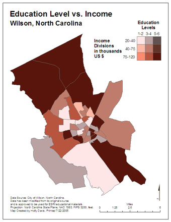
Bivariate Map Example
Map showing two variables - education level and income - in Wilson, North Carolina.
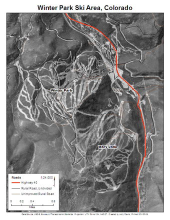
Winter Park - Aerial Image
Letter-sized (8.5" x 11") aerial map of the Winter Park Ski Area in Colorado.
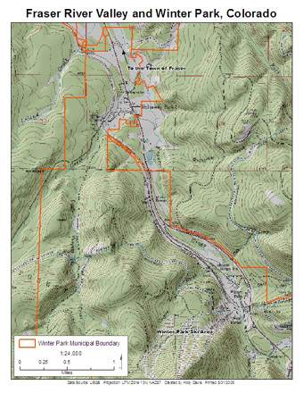
Winter Park - Topographic Map
Letter-sized (8.5" x 11") topographic map of Winter Park Ski Area and the Fraser River Valley in Colorado.
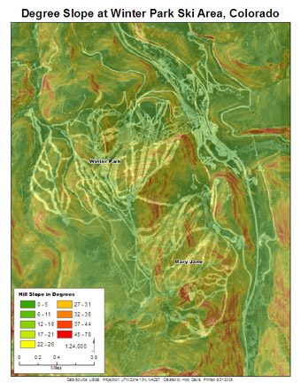
Winter Park - Slope Steepness
Letter-sized (8.5" x 11") map of the degree of slope of the mountains at the Winter Park Ski Area.
This map was created by performing a slope calcuation using Spatial Analyst on the Digital Elevation Model (DEM) for the area. In the center of the map, the slope varies from somewhat steep (yellow) to very steep (red) and back several times on a run (called "Outhouse") that connects the northwest Winter Park section of the ski area to the southeast Mary Jane section. The map accurately portrays these slope changes as a yellow area (moderately steep) marked by bands of red (very steep).
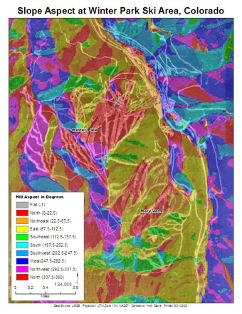
Winter Park - Slope Aspect
Letter-sized (8.5" x 11") map of the slope aspect of the mountains at the Winter Park Ski Area.
The large areas of red (north-facing) and yellow (east-facing) slopes show that this ski area is likely to weather changes caused by climate change better than an area with more south or west facing slope aspects since snow melts much more slowly on north- and east-facing slopes.
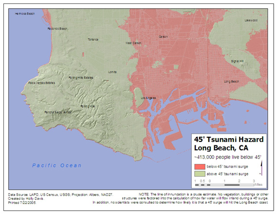
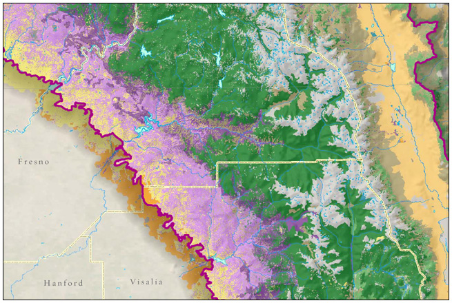
Long Beach 45' Tsunami Hazard
This 8.5" x 11" map shows the tsunami hazard if a 45-foot wave were to hit Long Beach, California. Areas that would be innudated are shown in red.