Data Vizualization Projects
VCS Basics Tutorial
This project invovled rewriting a VCS Jupyter Notebook to make it easier for new users to understand.
Technologies Used: Python, Jupyter Notebook, CDAT
Data Sources: CDAT sample data files (the intent is to show how to use VCS on users own data)
Jupyter Notebook Snapshot
This Python Jupyter Notebook tutorial provides an overview of the Visualization Control System (VCS) tools that are part of the Community Data Analysis Tools (CDAT) software package created by the Climate Group at Lawrence Livermore National Laboratory (LLNL).
For this particular Notebook, I created detailed “Getting Started” instructions for users unfamiliar with the tools, Jupyter Notebooks or conda, which is used for installing the CDAT software and creating a proper environment to run the CDAT tools.
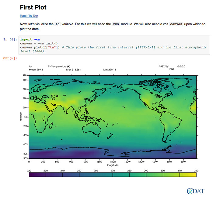
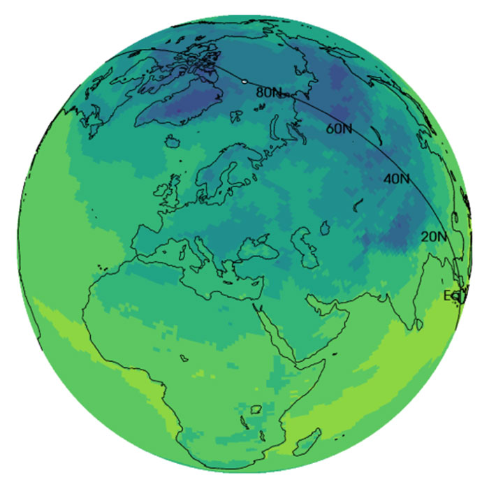
This first plot is of the air temperature over the entire globe in June of 1987.
Please visit the VCS Basics page to see the entire Jupyter Notebook.
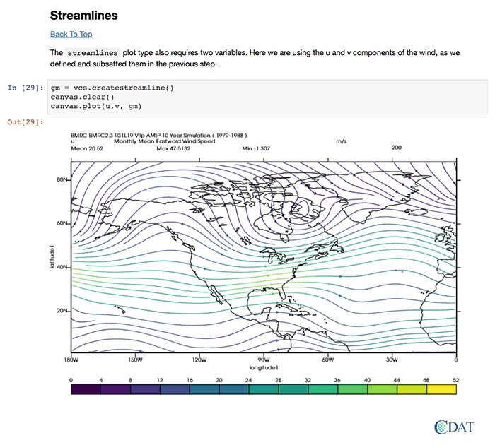
Visualizing Wind Flow Via Streamlines
One of VCS’s capabilities is plotting streamlines, which show how wind is flowing over the surface of the earth. In this example, the inputs are the u and v components of the wind from a NetCDF file. The resulting plot shows the monthly mean eastward flowing wind speed in m/s over North America for the 10-year period 1979-1988.
Please visit the VCS Basics page to see the entire Jupyter Notebook and additional VCS capabilites.
Plotting E3SM's Native Grid
This E3SM Jupyter Notebook illustrates how to plot results from the Energy Exascale Earth System Model (E3SM) on the native grid used by the model for all its calculations.
Technologies Used: Python, Jupyter Notebook, CDAT
Data Sources: CDAT sample data
Plot Data on the Native Grid
The Energy Exascale Earth System Model (E3SM) divides the globe up into rectangular pieces or grid cells. To improve efficiency, the E3SM native grid is not based on latitude or longitude, but uses a single location identifier for each cell. (If desired, the results can be converted or regridded to latitude and longitude values after the results are obtained.)
The advantages of plotting model output on the native E3SM grid include being able to see the results without spending time on regridding the data and eliminating a step where mistakes could possibly enter.
The first image in the Notebook (left) plots surface temperature on E3SM’s native grid. The grid cells of the native grid are not all the same size: some are rectangular and others are square. Additionally, the long axes of the rectangular cells are not all in the same direction: some are longitudinal; others are long in the latitudinal direction. In this first Notebook plot, users can see that the data is plotted on the native grid by looking at Africa, specifically the two darker green rectangles plotted within a lighter green area. Of these two rectangles, one has a long axis pointing toward the poles, the other parallels the equator.
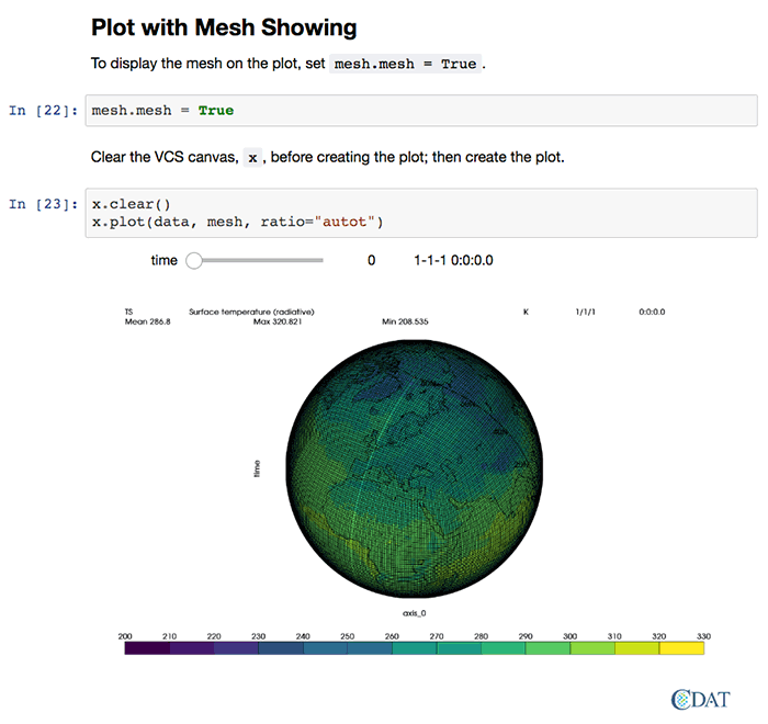
Add Native Grid Mesh
After plotting the data, the Notebook shows how to display the grid lines on top of the data.
To see the entire Jupyter Notebook, visit the E3SM VCS Native Grid Plot page.
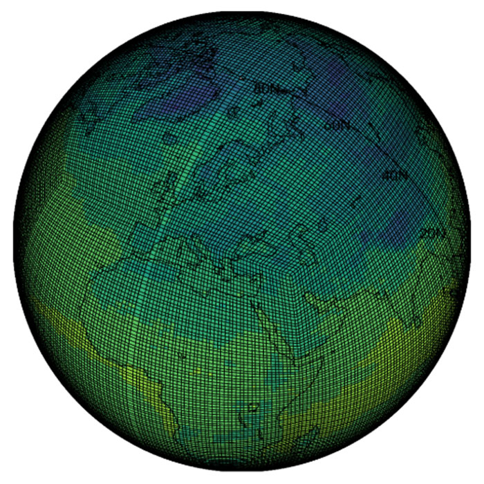
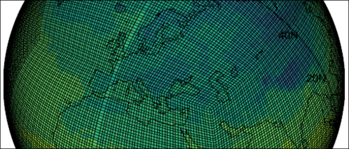
Close-up of the Native Grid Mesh
In this zoomed-in view of the globe showing the native grid lines, users can see two “corners” in the grid: one over the Middle East and the other over the Atlantic Ocean. The E3SM native grid is a “cube-sphere”, which can be visualized by thinking about a cube, then imagining pumping it full of air like you would a soccer ball to puff out the sides of the cube to make a sphere.
To see the entire Jupyter Notebook visit the E3SM VCS Native Grid Plot page.
Taylor Diagram Tutorial
This Python Taylor Diagram Jupyter Notebook is a tutorial for creating a Taylor Diagram using CDAT's VCS package.
Technologies Used: Python, Jupyter Notebook, CDAT
Data Sources: None: realistic data are made-up to illustrate how to create a Taylor Diagram
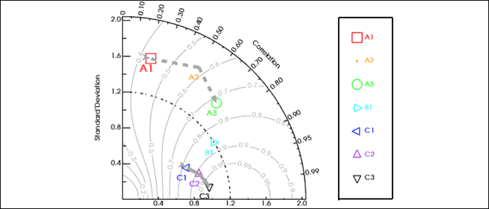
Taylor Diagram Basics
Taylor diagrams are graphs designed to visually indicate which of several models of a system, process, or phenomenon is most realistic. The diagram, invented by Karl E. Taylor in 1994 (published in 2001), facilitates comparing different models or tracking changes in performance of a single model as it is modified. The diagram can also be used to quantify the degree of correspondence between modeled and observed behavior. In general, the diagram uses three statistics: the Pearson correlation coefficient, the root-mean-square error (RMSE), and the standard deviation.
Taylor diagrams have been used widely to evaluate models designed to study climate and other aspects of Earth’s environment. (See Wikipedia's Taylor Diagram page and Taylor (2001) for details.)
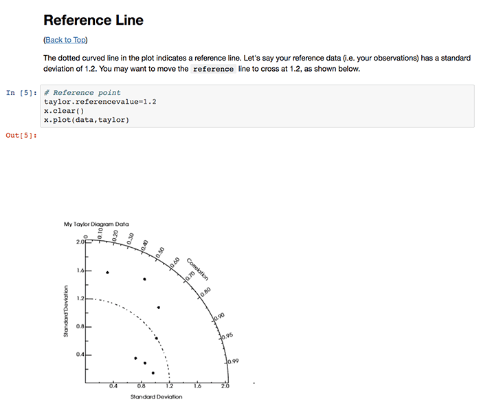
This image shows how to draw a reference line at 1.2 on the diagram to represent the reference data's standard deviation of 1.2.
To view the entire Jupyter Notebook, visit the Taylor Diagram Tutorial page.
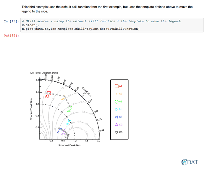
More Complex Diagram
This diagram includes custom colors and labels, a custom legend, and the contours of an additional measure of skill.
See Figures 10 and 11 of Taylor 2001: Summarizing multiple aspects of model performance in a single diagram, Journal of Geophysical Research, 106(D7): 7183-7192, for details on the skill function.
To view the entire Jupyter Notebook, visit the Taylor Diagram Tutorial page.

Close-Up of Complex Diagram
This image provides a zoomed-in view of the previous diagram which is difficult to read in the screen shot of the Notebook page.
To view the entire Jupyter Notebook, visit the Taylor Diagram Tutorial page.
4D Temperature Anomaly Animation
This Temperature Anomaly Notebook illustrates using VCS and DV3D (two CDAT tools) to plot three dimensional air temperature anomaly data through time (the 4th dimension).
Technologies Used: Python, Jupyter Notebook, CDAT
Data Sources: CDAT sample data
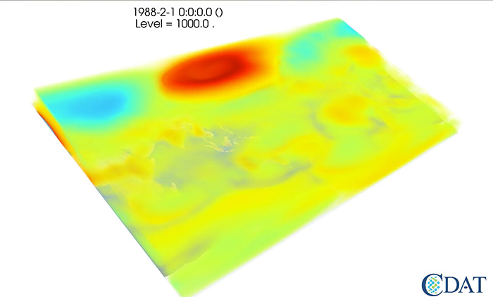
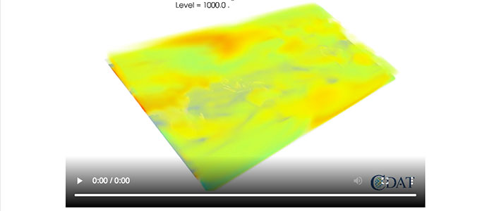
February Snapshot
The data for this example spans 11 months of air temperature data, one value for each month. Instead of plotting the data outright, it is more meaningful to plot the temperature anomaly: how much each temperature value differs from the mean or average temperature of the dataset.
The Notebook shows how to create a single 3D temperature anomaly image for each month of data. The month of February 1988 is pictured here.
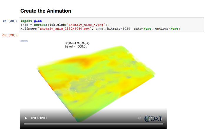
3D Animation
Stringing the single monthly images together creates the animation.
To view the animation, see the last section of the "4D Air Temperature Anomaly - 1920 x 1080 Size" Jupyter Notebook. With only 11 time steps, the movie goes by quickly.
To see the entire notebook, visit the 4D Air Temperature Anomaly - 1920 x 1080 Size tutorial page.
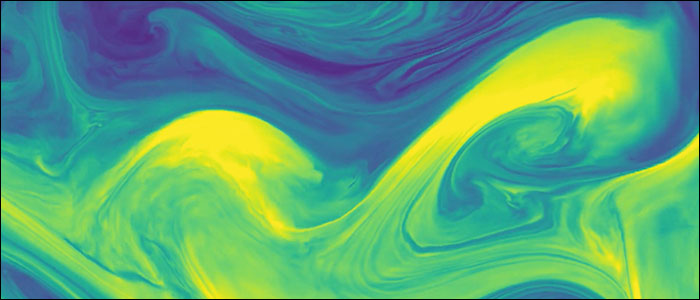
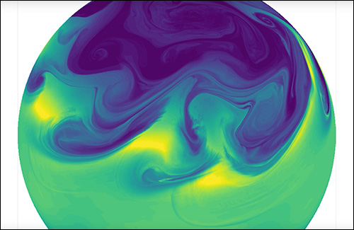
Test Case Output
The animation was produced using high-frequency output of the specific humidity field from a moist baroclinic-instability idealized test case. In this test case, a small perturbation to a geostrophically-balanced initial state of the Earth's atmosphere triggers baroclinic instability which grows into chaotic multiscale structures.
Watch the E3SM Nonhydrostatic Dynamical Core Animation video on E3SM's YouTube Channel.
Read the E3SM Nonhydrostatic Dynamical Core story on the E3SM.org website to learn more about the test case and the context for the video.
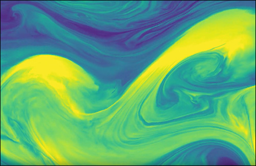
Close-Up of Eddy Activity
The baroclinic instability is responsible for much of the eddy activity (weather) in Earth’s midlatitudes. The video zoomes in on this eddy activity which is essentially waves of storms moving across the globe.
Watch the E3SM Nonhydrostatic Dynamical Core Animation video on E3SM's YouTube Channel.
Read the E3SM Nonhydrostatic Dynamical Core story on the E3SM.org website to learn more about the test case and the context for the video.